# A tibble: 6 × 8
species island bill_length_mm bill_depth_mm flipper_l…¹ body_…² sex year
<fct> <fct> <dbl> <dbl> <int> <int> <fct> <int>
1 Adelie Torgersen 39.1 18.7 181 3750 male 2007
2 Adelie Torgersen 39.5 17.4 186 3800 fema… 2007
3 Adelie Torgersen 40.3 18 195 3250 fema… 2007
4 Adelie Torgersen NA NA NA NA <NA> 2007
5 Adelie Torgersen 36.7 19.3 193 3450 fema… 2007
6 Adelie Torgersen 39.3 20.6 190 3650 male 2007
# … with abbreviated variable names ¹flipper_length_mm, ²body_mass_gData Visualization with ggplot2
what is tidy data
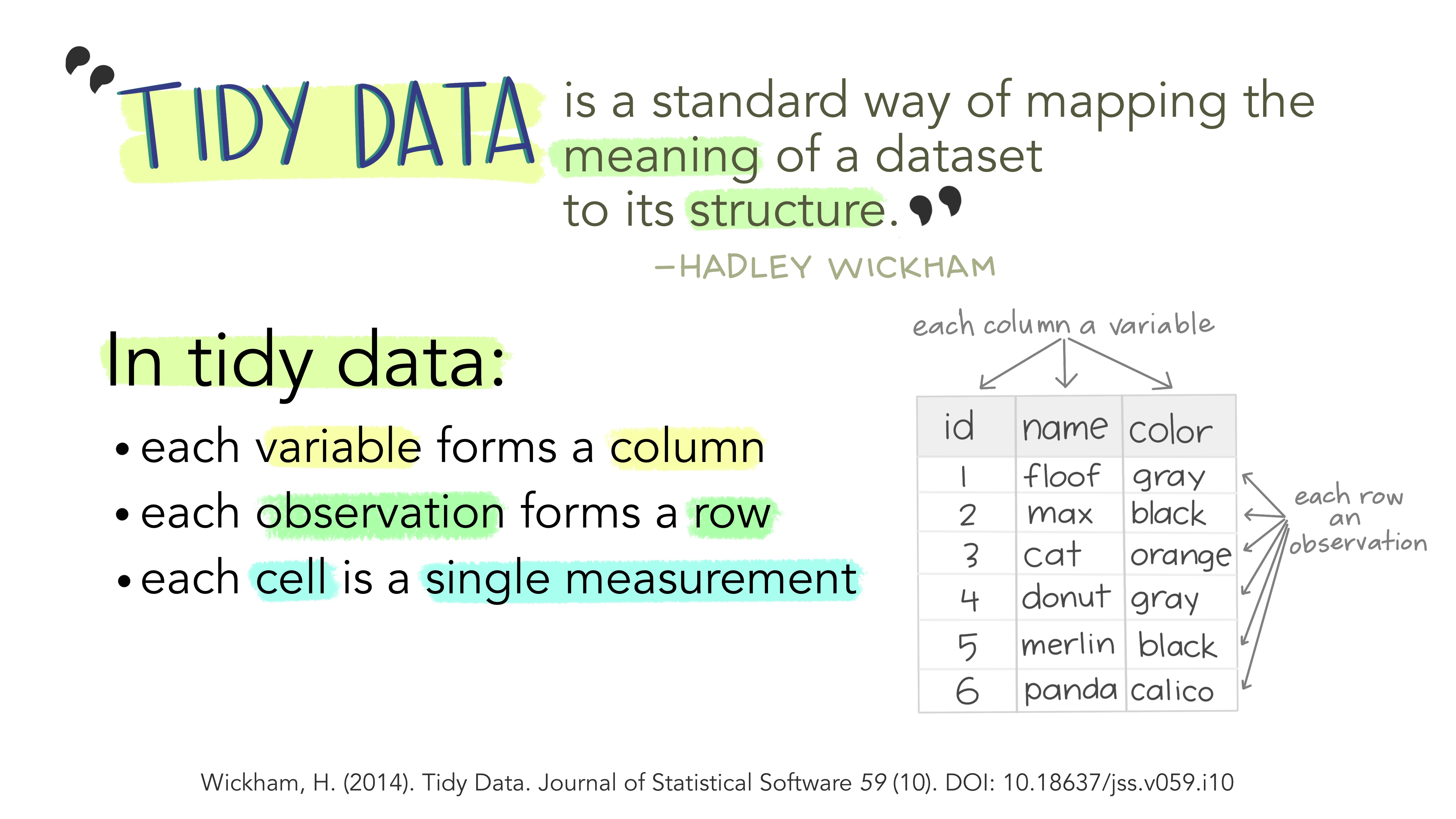
what is tidy data
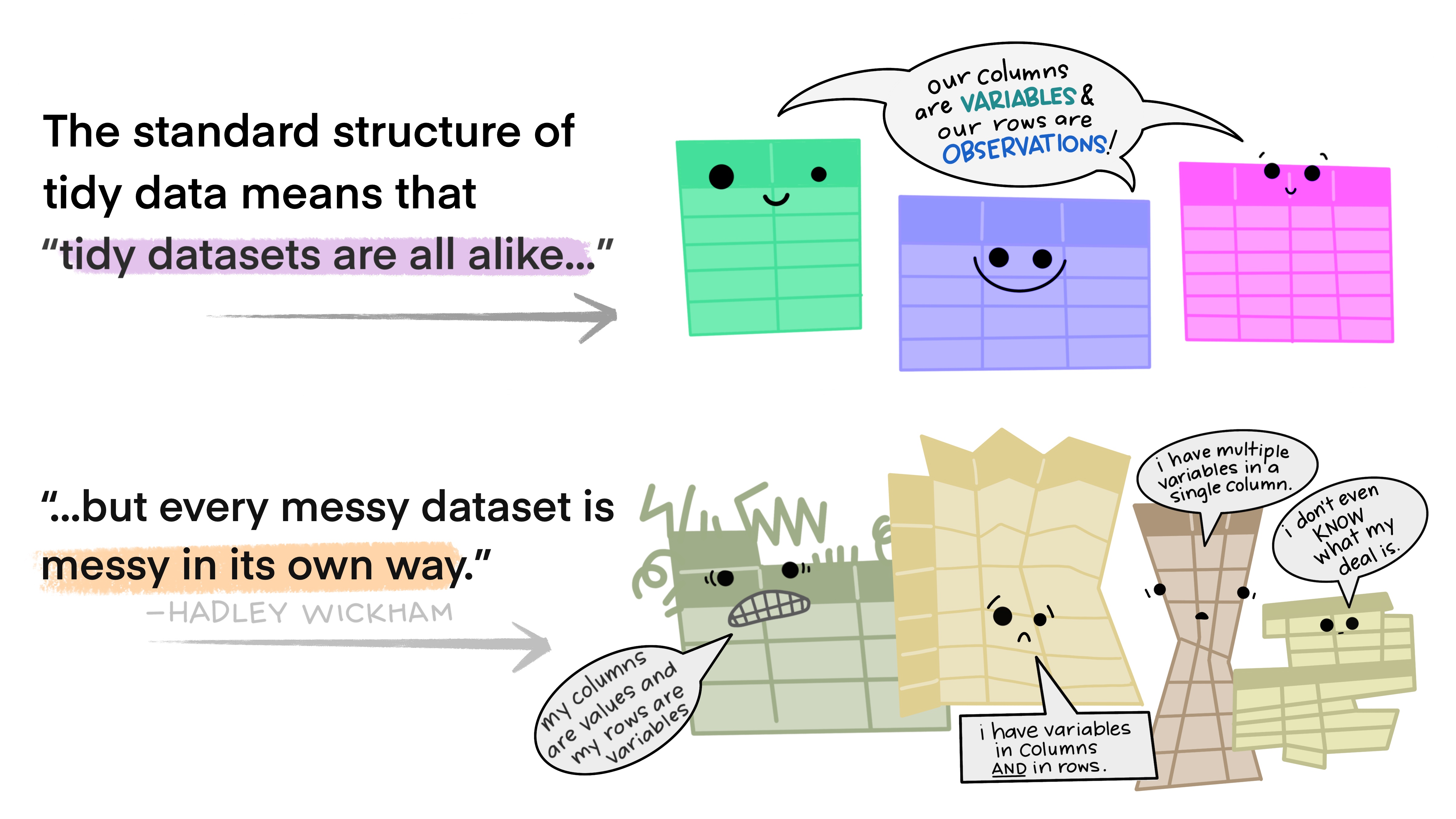
what is tidy data
in essence, tidy data is data that can be put through standardized tools

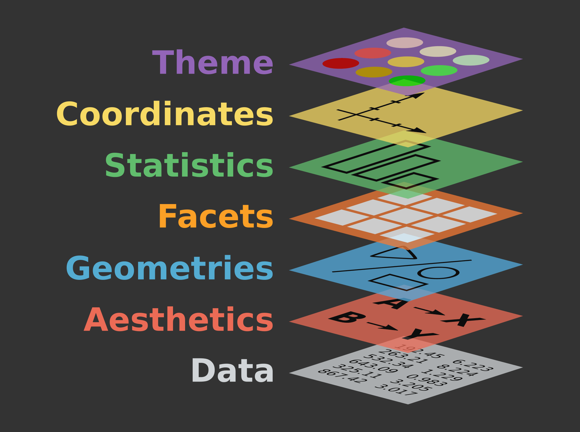
the grammar of graphics
the “grammar of graphics” is the answer to the question “what is a statistical graphic?”
our first ggplot

our first ggplot
our first ggplot

our first ggplot
our first ggplot
ggplot(penguins,
       aes(
         x = bill_length_mm,
         y = bill_depth_mm,
         color = species,
         shape = species,
         label = species,
         group = species
       )) +
  stat_ellipse() +
  geom_point() +
  geom_label(
    data = penguins |> group_by(species) |> summarize(across(c(bill_length_mm, bill_depth_mm), mean, na.rm=T)),
    alpha = 0.8
  ) +
  xlab("Bill Length [mm]") +
  ylab("Bill Depth [mm]") +
  ggtitle("Relationship of Species, Bill Length, and Bill Depth",
          "Penguins observed near Palmer Station, Antarctica, 2007-2009") +
  theme_bw() +
  theme(legend.position = 'none')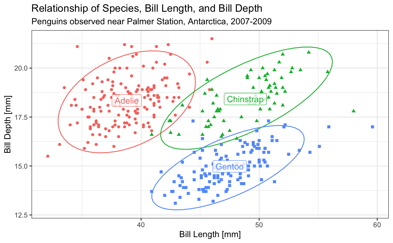
visual channels
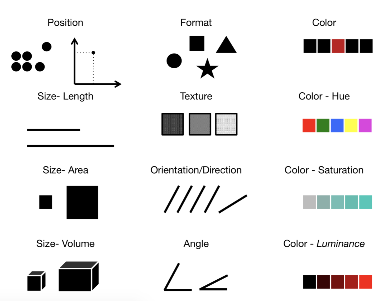
visual channels
geom_bar

geom_col
# A tibble: 3 × 2
  species       n
  <fct>     <int>
1 Adelie      152
2 Chinstrap    68
3 Gentoo      124
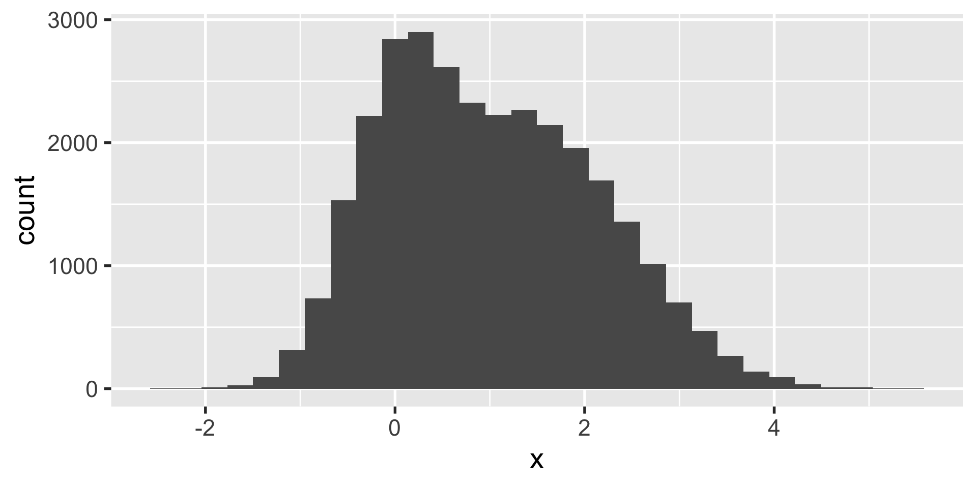
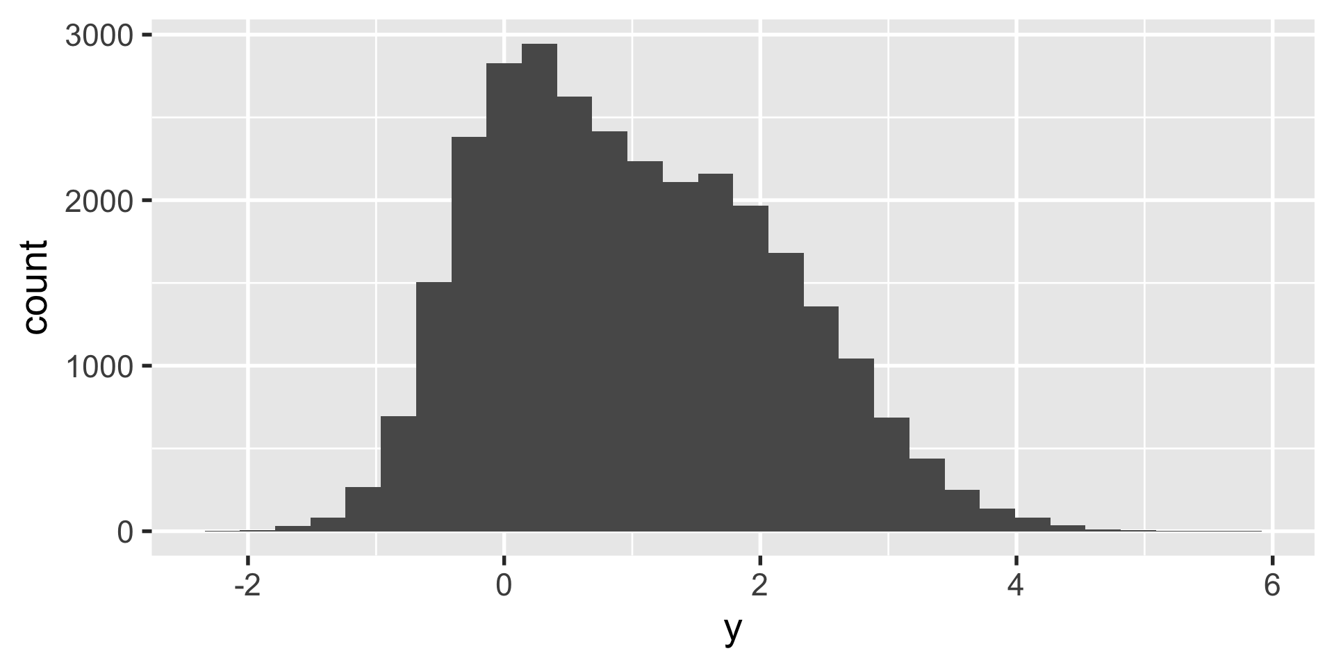
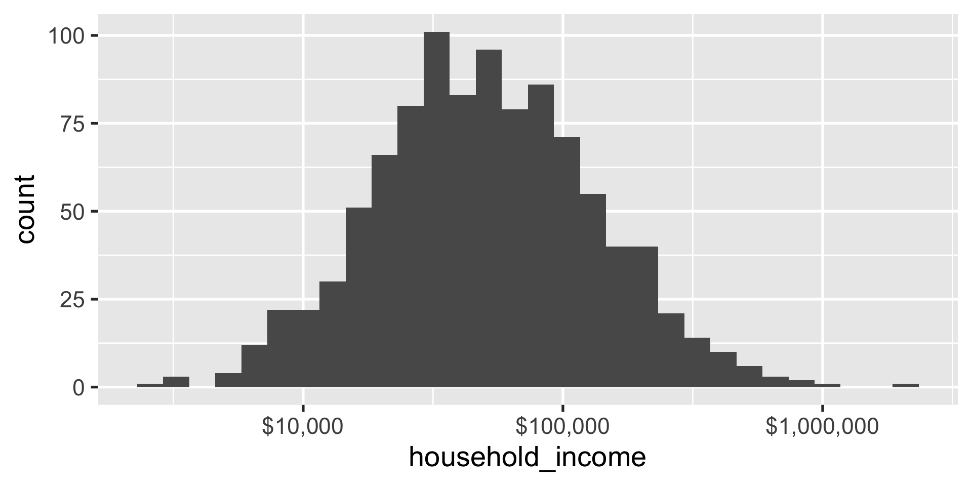
geom_histogram
geom_histogram
geom_histogram

geom_density
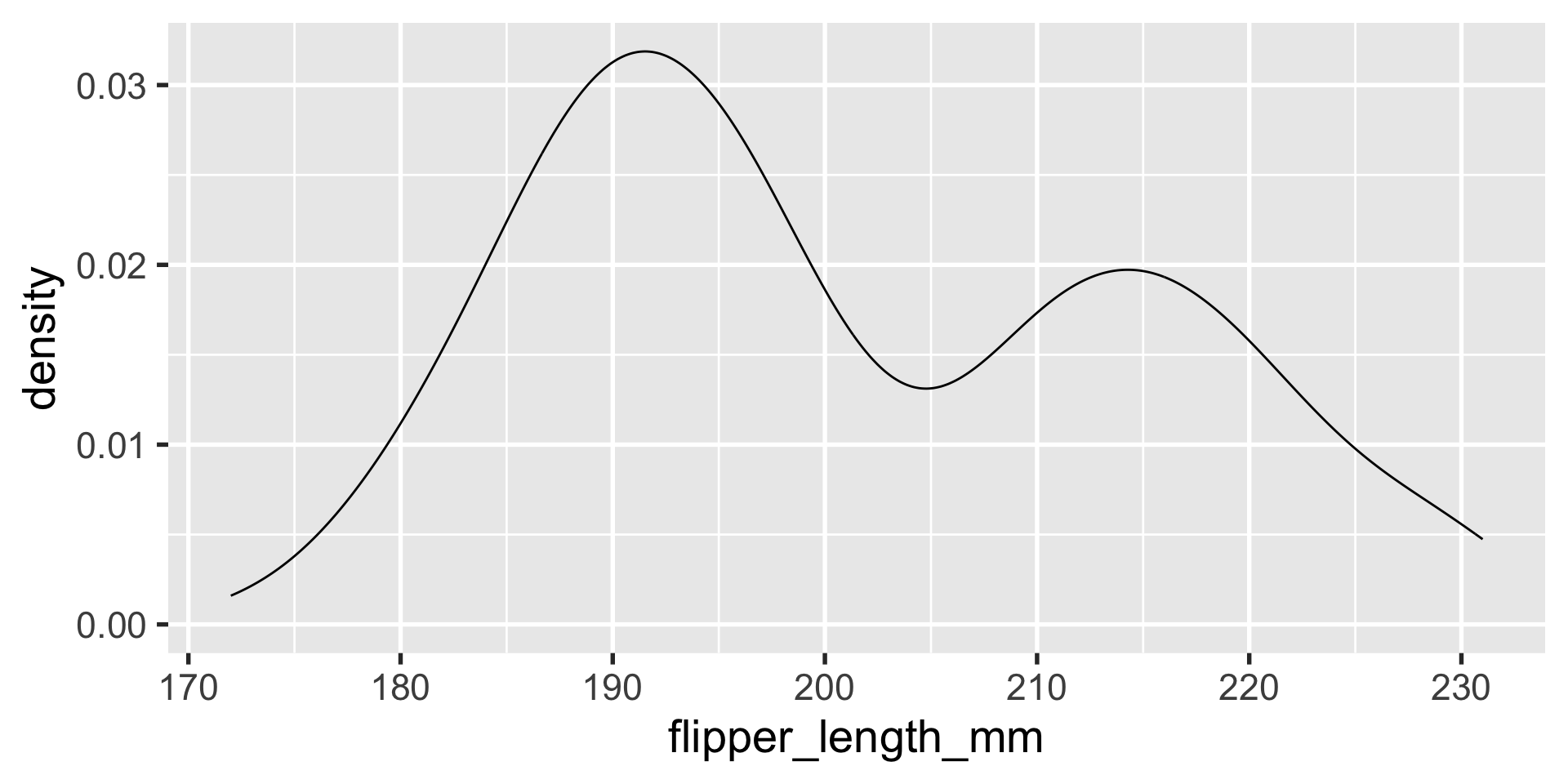
geom_density
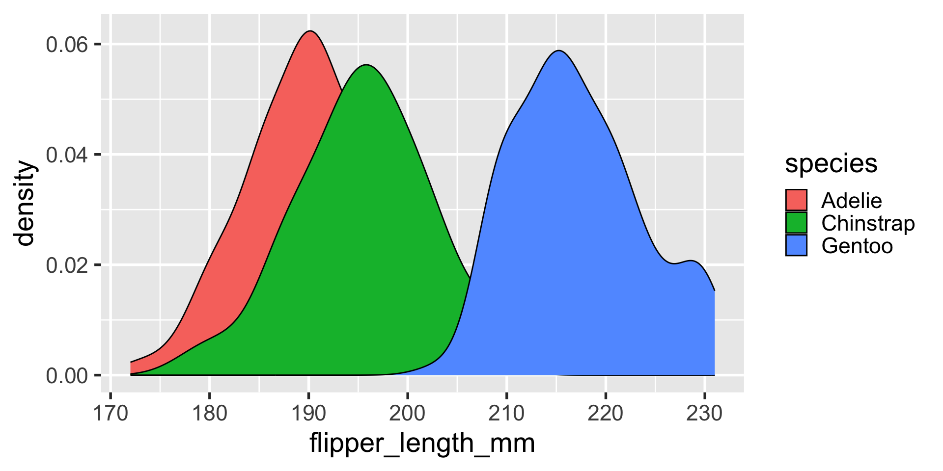
geom_density

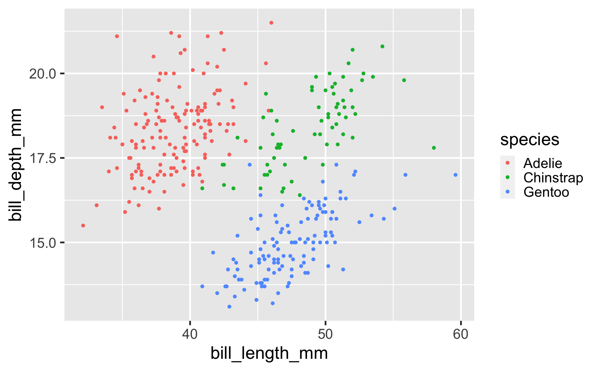
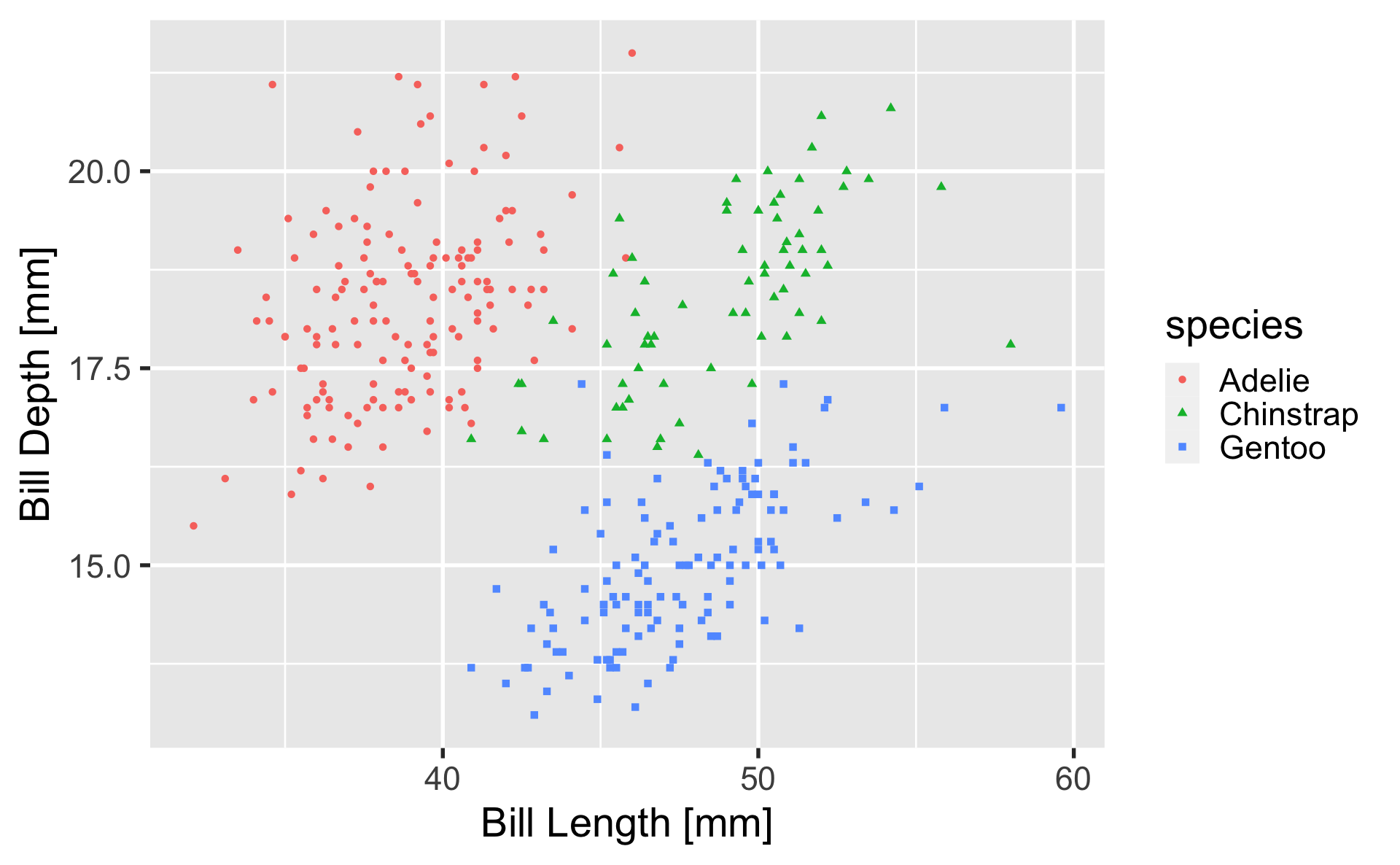
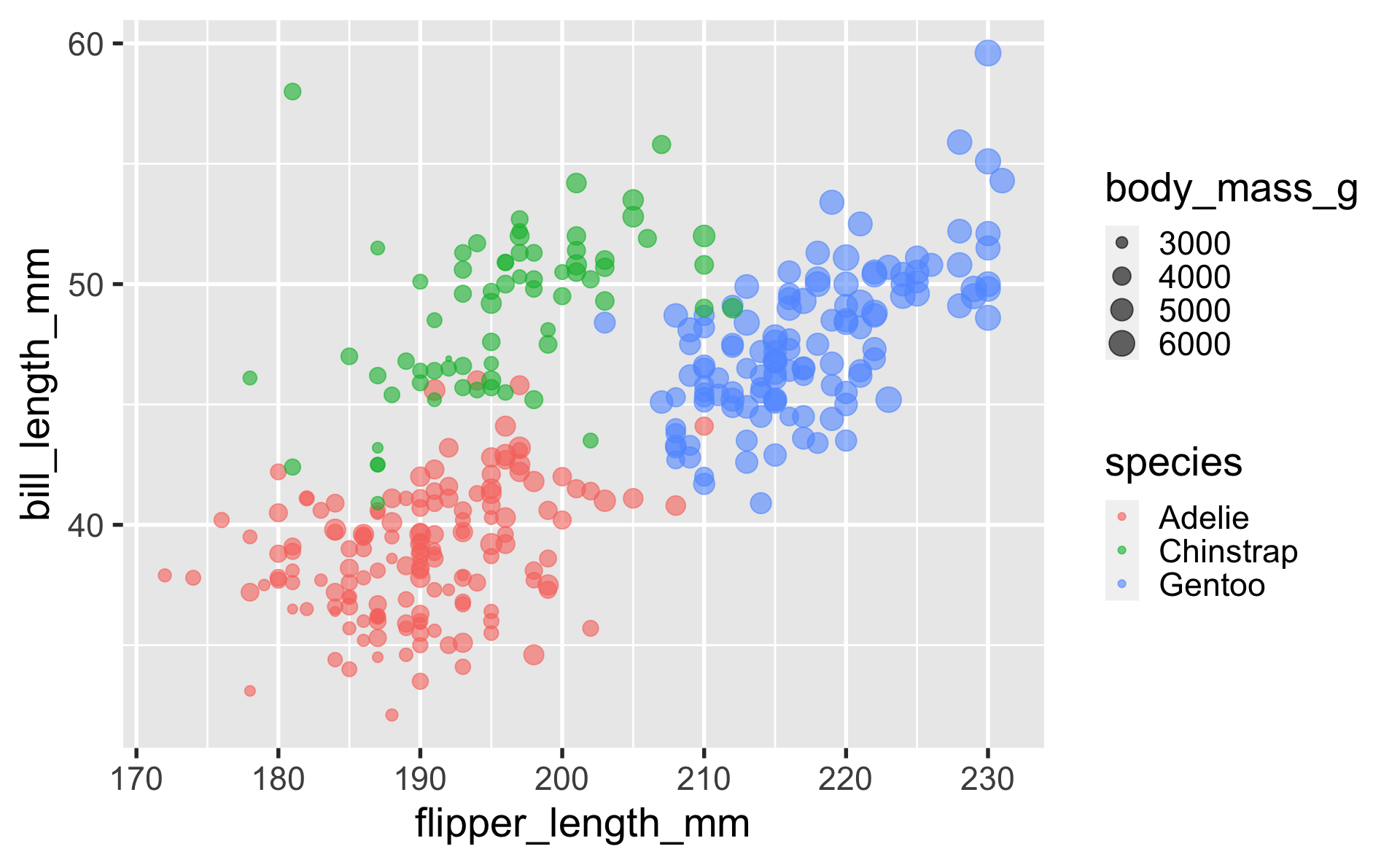
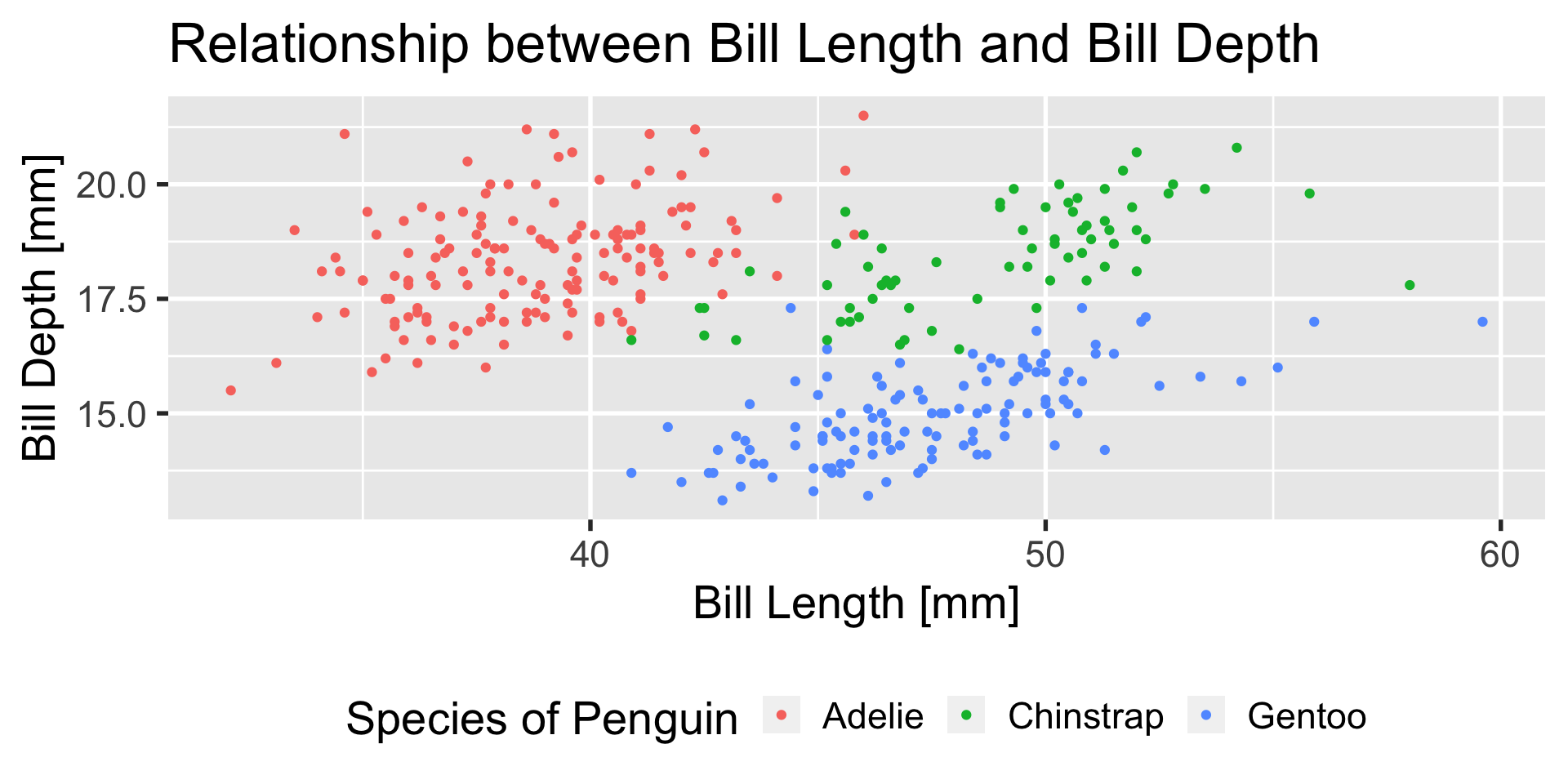
geom_point
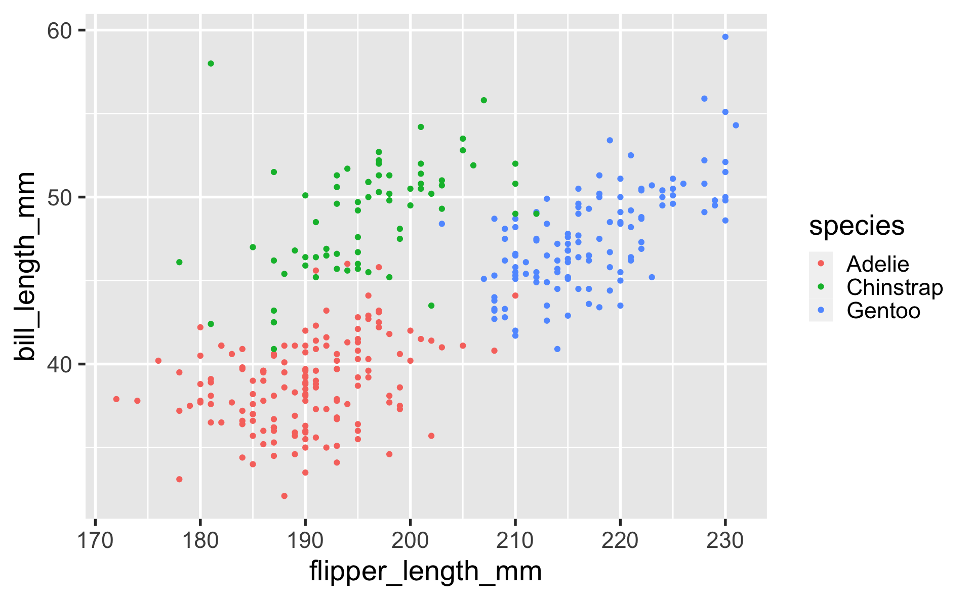
geom_point

geom_point
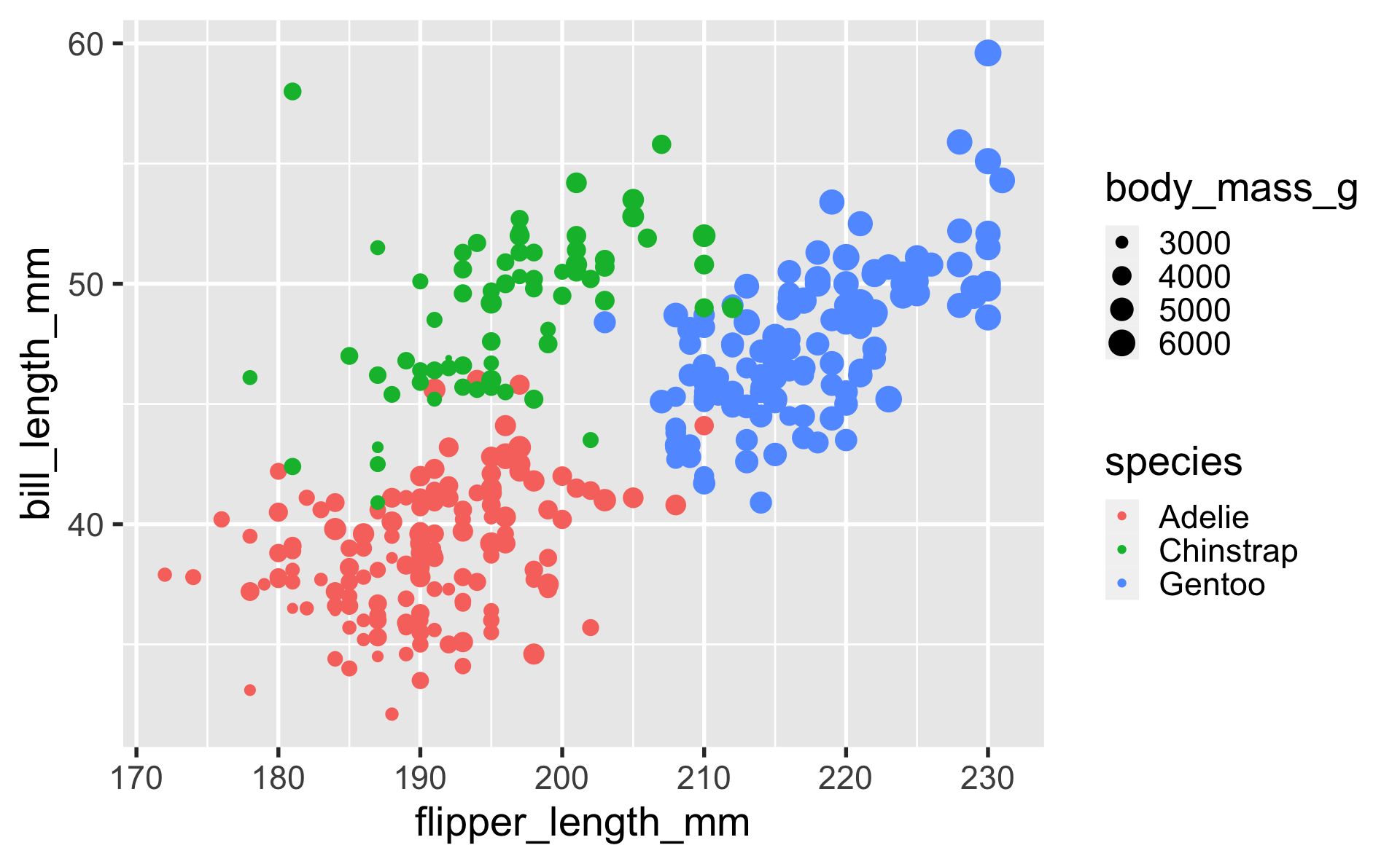
geom_point
geom_line
lines are great to use to depict observations that are conceptually connected — either across time, or thematically.
for example, maybe we would want to know if the average flipper length in the population of penguins observed is changing over time.
flipper_length_over_time <-
  data.frame(
  year = c(2007, 2007, 2007,
           2008, 2008, 2008,
           2009, 2009, 2009),
  flipper_length_mm =
    c(186.5, 192.4, 215.1,
      191.0, 197.7, 217.5,
      192.0, 198.0, 218.4),
  species = as.factor(
    c(
      "Adelie", "Chinstrap", "Gentoo",
      "Adelie", "Chinstrap", "Gentoo",
      "Adelie", "Chinstrap", "Gentoo"
    )))

ggplot(flipper_length_over_time,
       aes(x = year,
           y = flipper_length_mm,
           color = species)) +
  geom_line()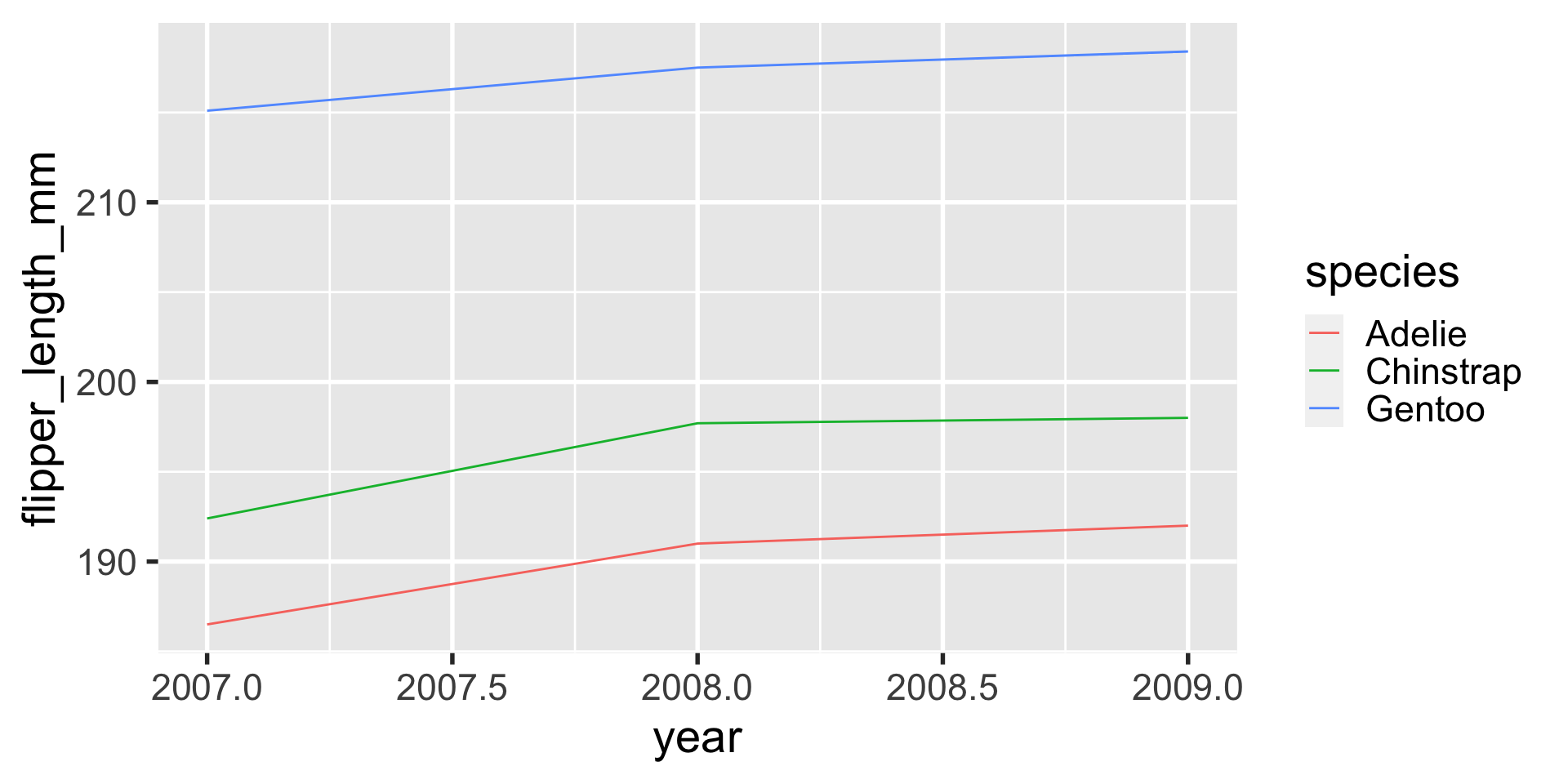
geom_line
a lot of the time when using geom_line, I like to pair that with a geom_point layer on top of it, so where the observations are is more clear.

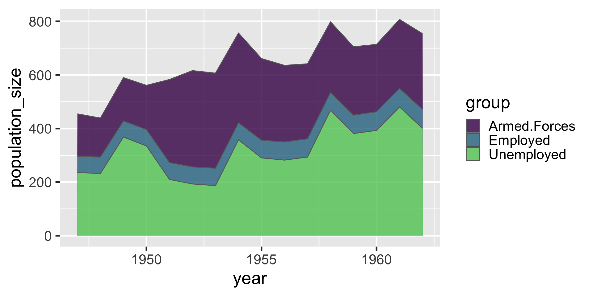
geom_area
geom_area when used with only one group of data is similar to geom_line, except it fills in the area beneath. this can be useful for depicting how a population breaks down into strata over time.
| year | group | population_size |
|---|---|---|
| 1947 | Employed | 60.323 |
| 1947 | Unemployed | 235.600 |
| 1947 | Armed.Forces | 159.000 |
| 1948 | Employed | 61.122 |
| 1948 | Unemployed | 232.500 |
| 1948 | Armed.Forces | 145.600 |
| 1949 | Employed | 60.171 |
| 1949 | Unemployed | 368.200 |
| 1949 | Armed.Forces | 161.600 |
| 1950 | Employed | 61.187 |
| 1950 | Unemployed | 335.100 |
| 1950 | Armed.Forces | 165.000 |
| 1951 | Employed | 63.221 |
| 1951 | Unemployed | 209.900 |
| 1951 | Armed.Forces | 309.900 |
| 1952 | Employed | 63.639 |
| 1952 | Unemployed | 193.200 |
| 1952 | Armed.Forces | 359.400 |
| 1953 | Employed | 64.989 |
| 1953 | Unemployed | 187.000 |
| 1953 | Armed.Forces | 354.700 |
| 1954 | Employed | 63.761 |
| 1954 | Unemployed | 357.800 |
| 1954 | Armed.Forces | 335.000 |
| 1955 | Employed | 66.019 |
| 1955 | Unemployed | 290.400 |
| 1955 | Armed.Forces | 304.800 |
| 1956 | Employed | 67.857 |
| 1956 | Unemployed | 282.200 |
| 1956 | Armed.Forces | 285.700 |
| 1957 | Employed | 68.169 |
| 1957 | Unemployed | 293.600 |
| 1957 | Armed.Forces | 279.800 |
| 1958 | Employed | 66.513 |
| 1958 | Unemployed | 468.100 |
| 1958 | Armed.Forces | 263.700 |
| 1959 | Employed | 68.655 |
| 1959 | Unemployed | 381.300 |
| 1959 | Armed.Forces | 255.200 |
| 1960 | Employed | 69.564 |
| 1960 | Unemployed | 393.100 |
| 1960 | Armed.Forces | 251.400 |
| 1961 | Employed | 69.331 |
| 1961 | Unemployed | 480.600 |
| 1961 | Armed.Forces | 257.200 |
| 1962 | Employed | 70.551 |
| 1962 | Unemployed | 400.700 |
| 1962 | Armed.Forces | 282.700 |
geom_text
we can use geom_text similarly to geom_point, but instead of plotting a small mark, geom_text places text on the graph.
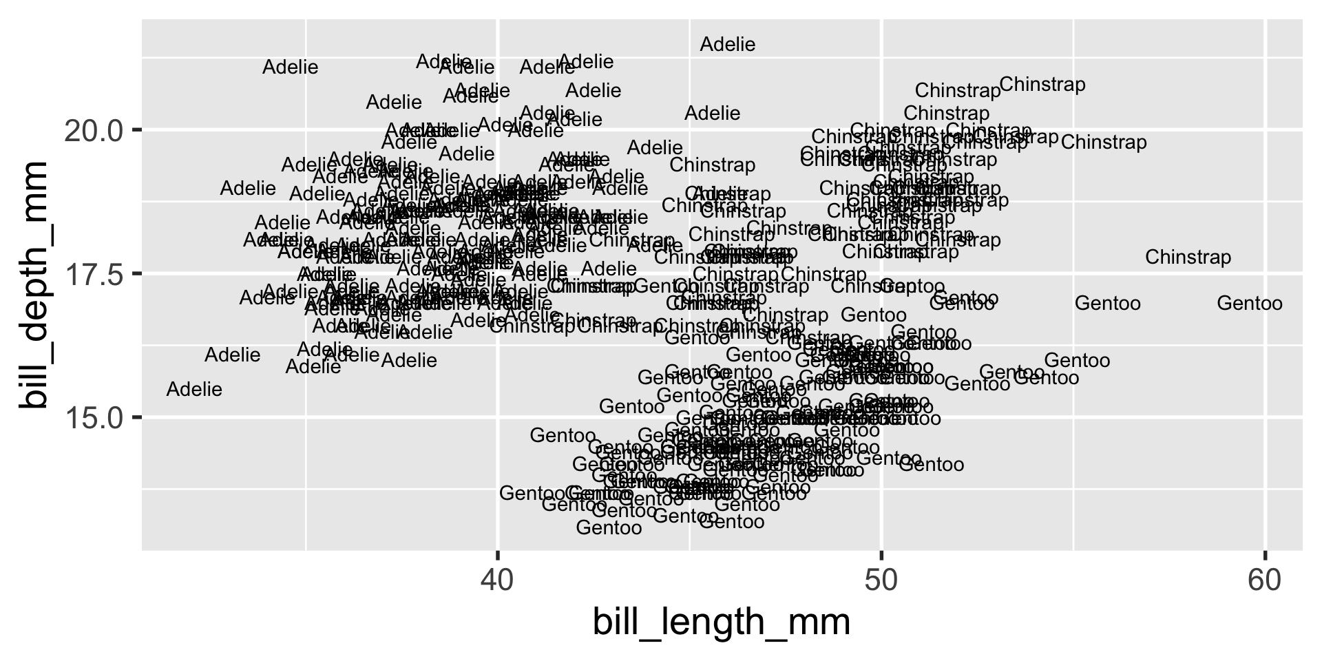
geom_text
one use of geom_text that I particularly enjoy is to make what usually has to be guesstimated precise:
# A tibble: 3 × 2
  species       n
  <fct>     <int>
1 Adelie      152
2 Chinstrap    68
3 Gentoo      124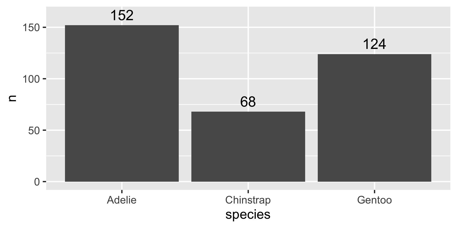
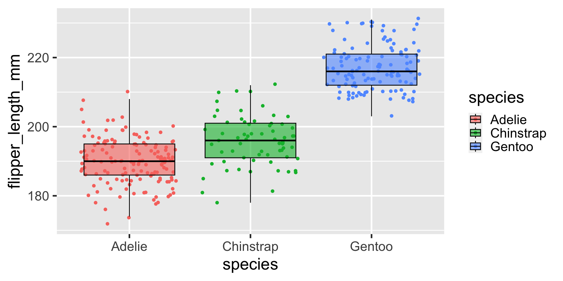
geom_boxplot
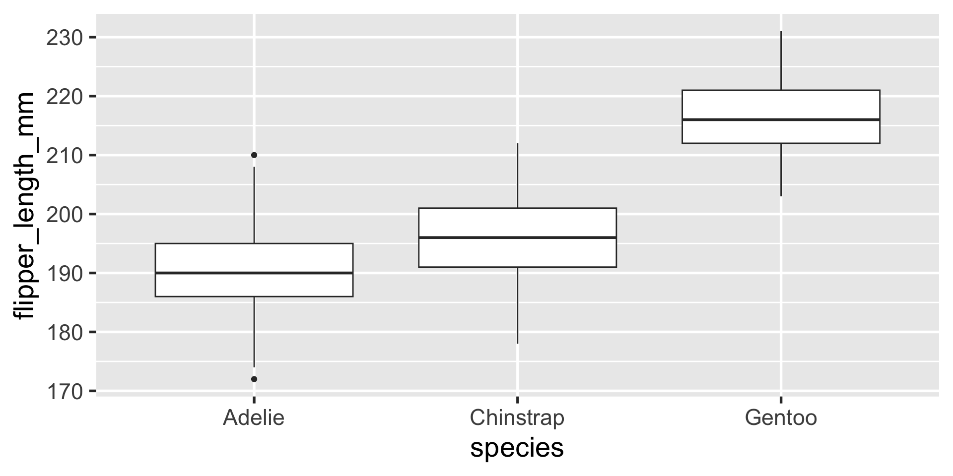
geom_boxplot
if i am going to use boxplots, something i often like to do is to plot the data with jitter behind the boxplots and give the boxplots some transparency.
also, i’m a sucker for colorful figures, so i’ll almost always add color
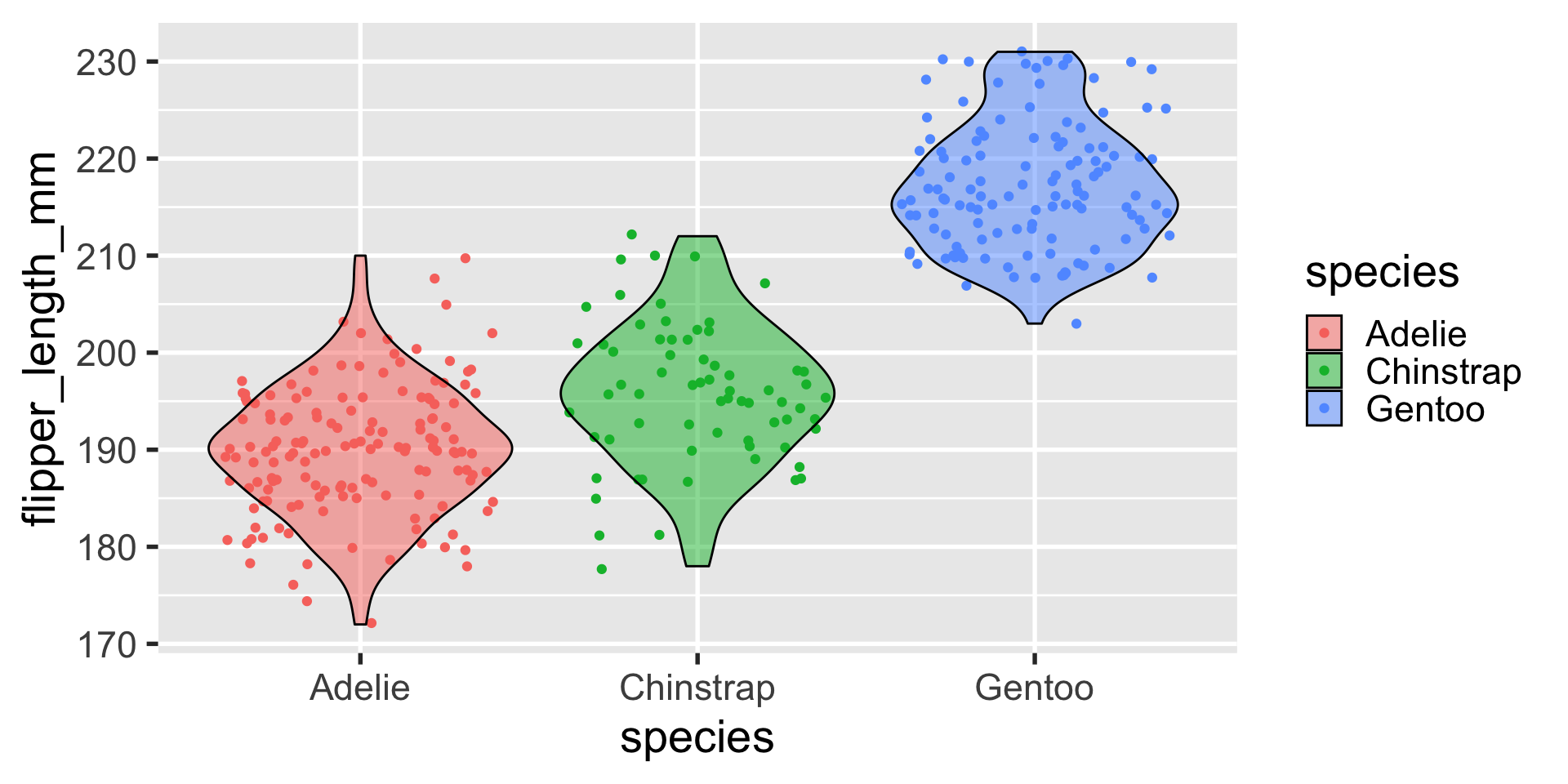
geom_violin
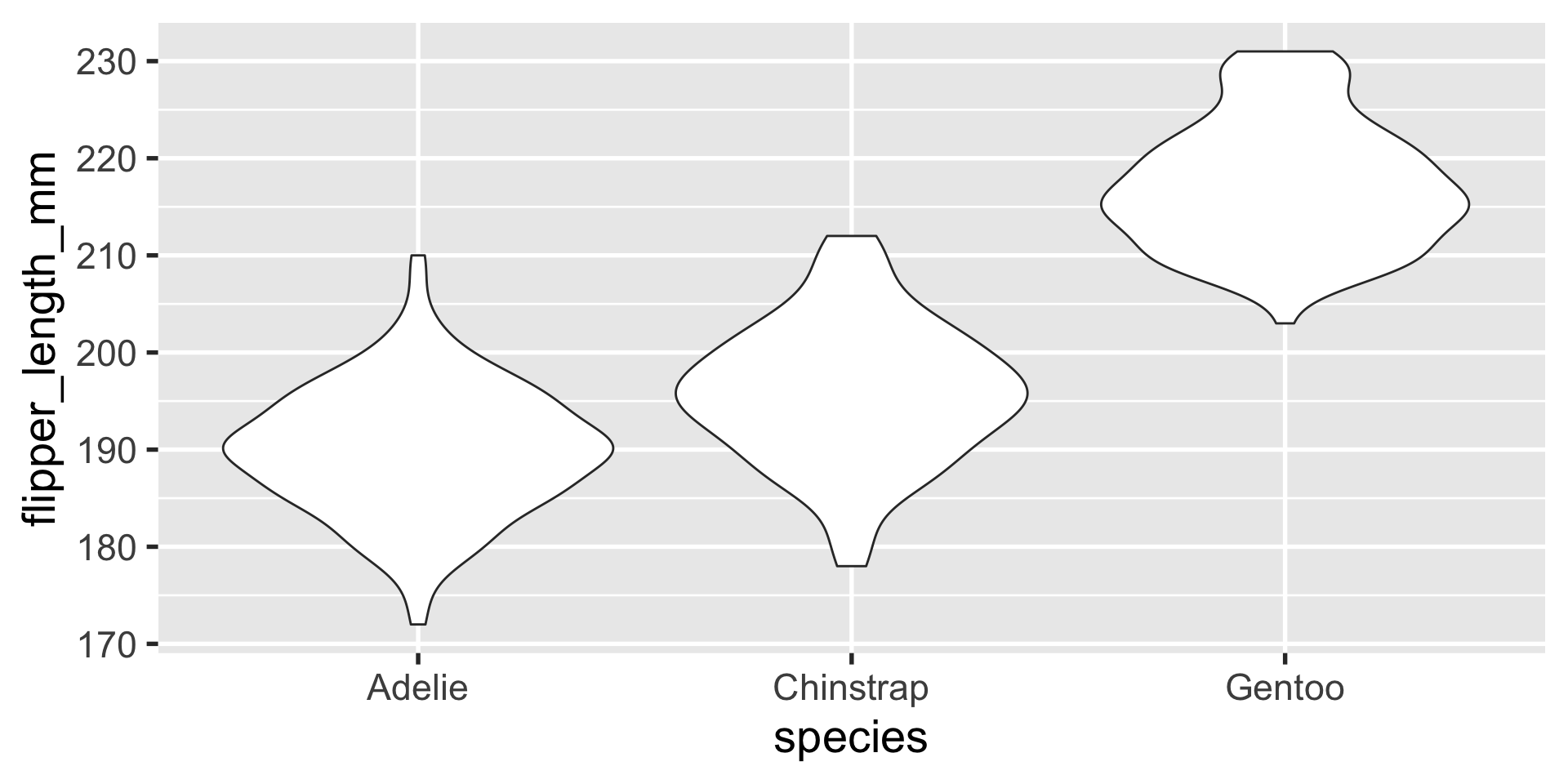
geom_violin
a similar layout can be done with geom_violin
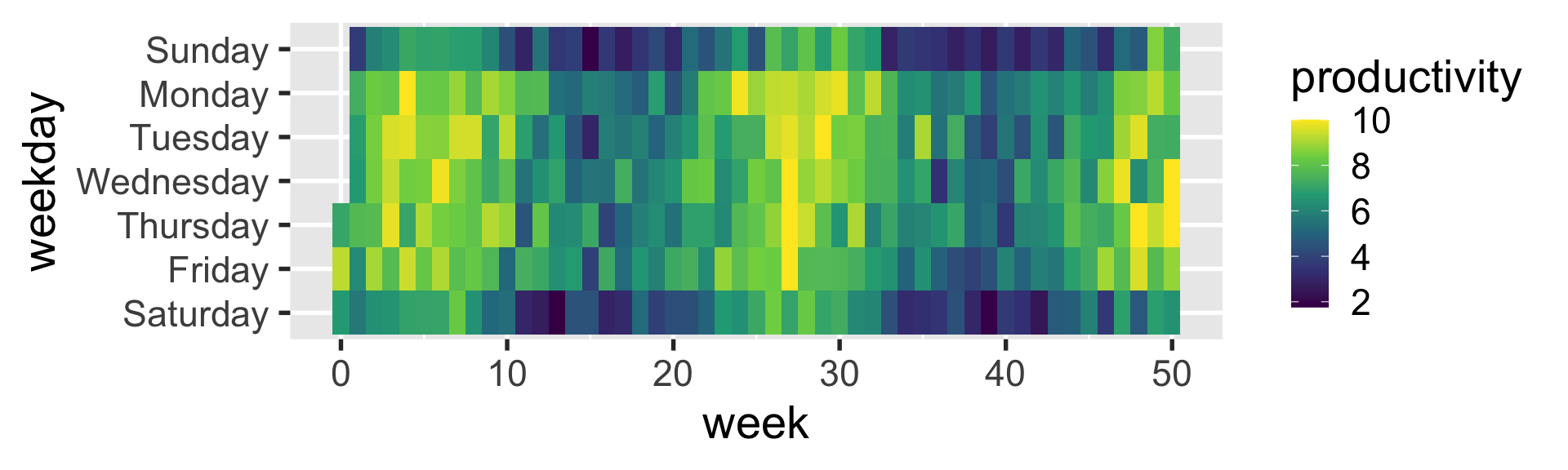
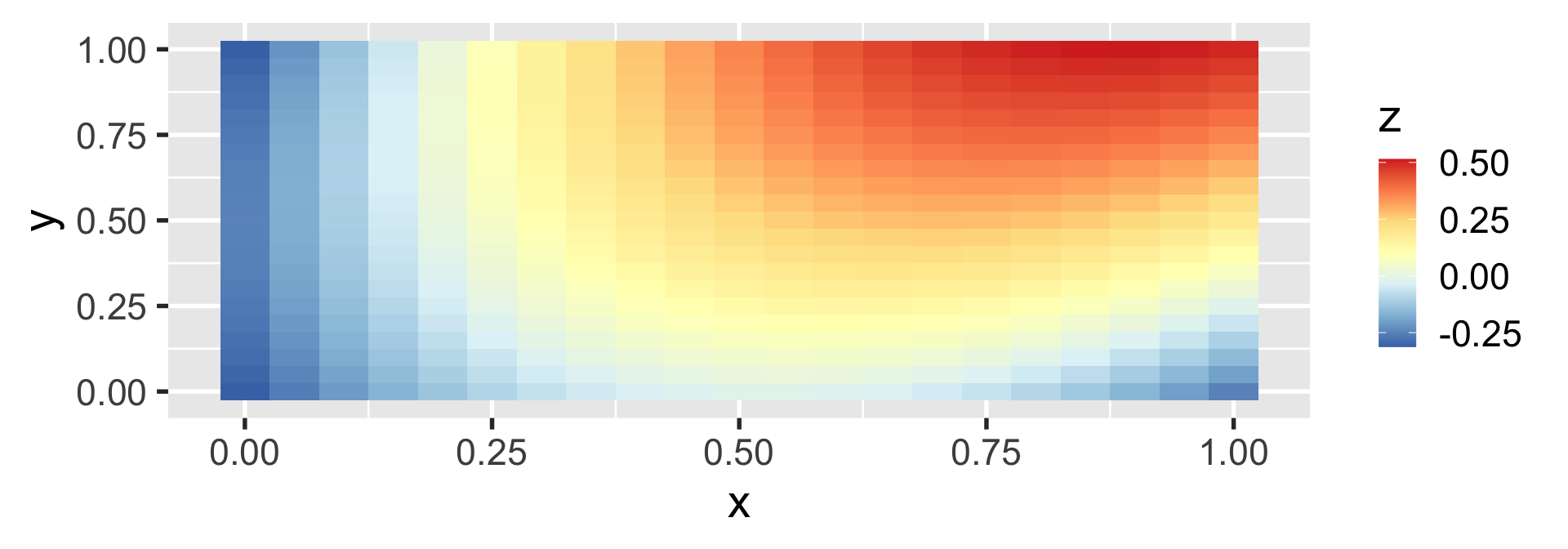
geom_tile
heatmaps can be created with geom_tile
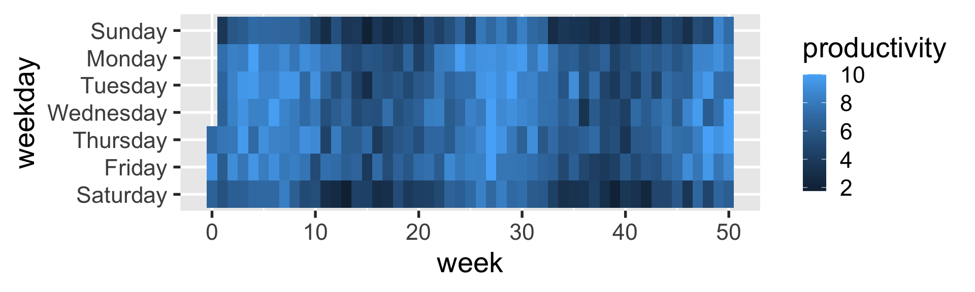
geom_tile
facet_wrap
faceting generates multiple panels within a visualization, each showing a different subset of the data.

facet_grid
facet_grid gives you more precision in how the faceting panels are laid out by using the left-hand-side and right-hand-side to indicate to the rows and columns.
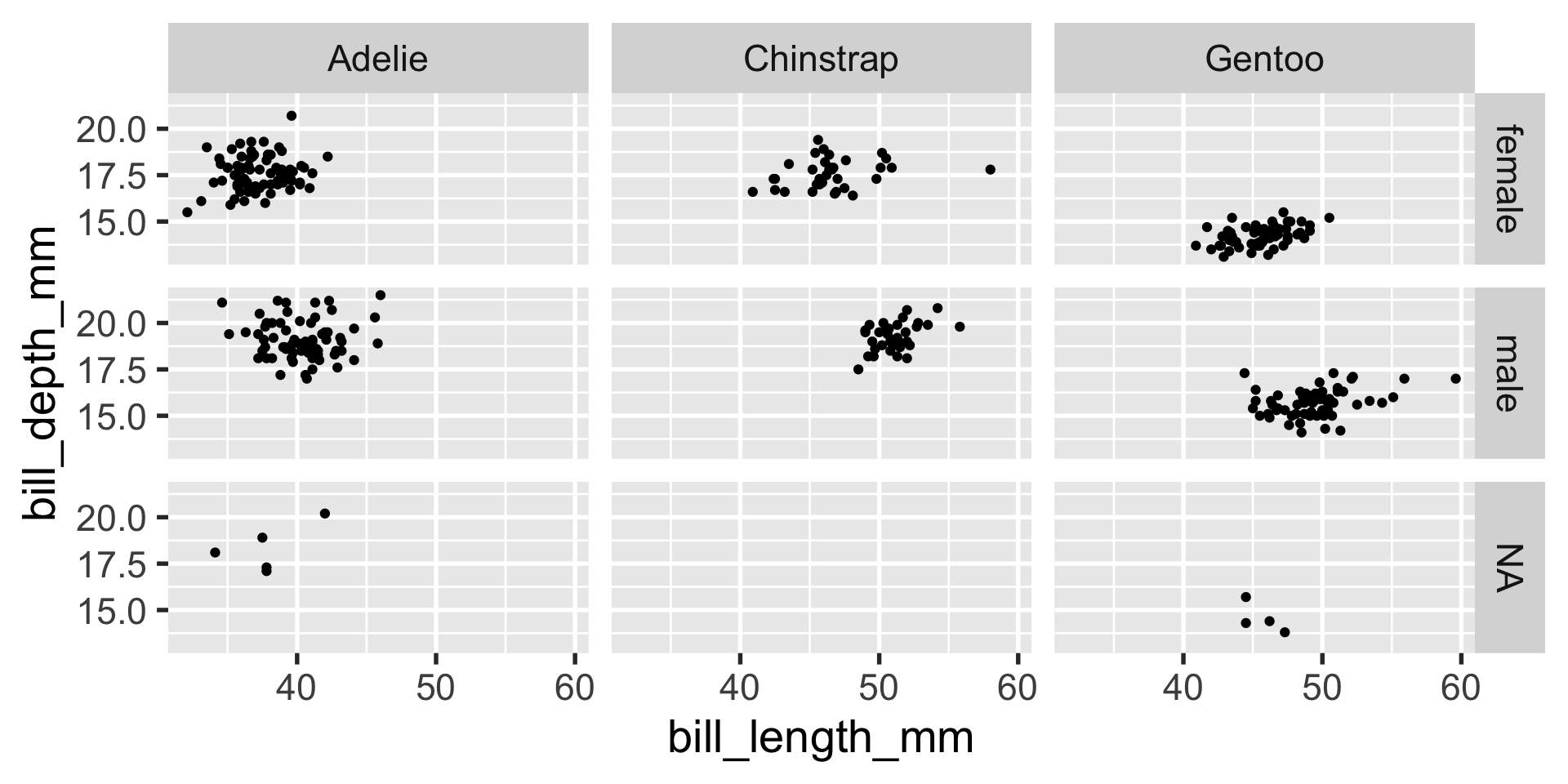

the easiest way for me to remember which variable corresponds to the columns vs. rows in the facet_grid formula is to remember how formulas usually look, as in y ~ x or y = m*x + b.
y is the variable that corresponds to the vertical dimension and is on the left-hand-side – so y or the left-hand-side corresponds to the rows, while x informs us about the horizontal dimension, so x or the right-hand-side corresponds to the columns.
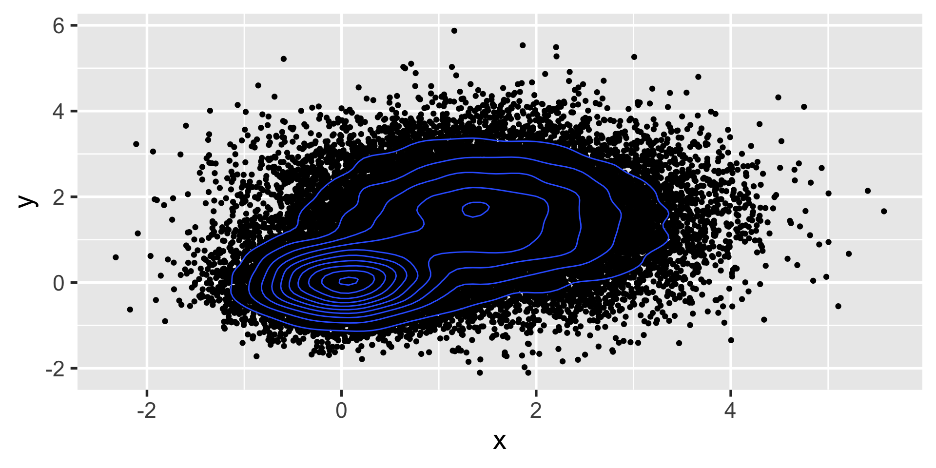
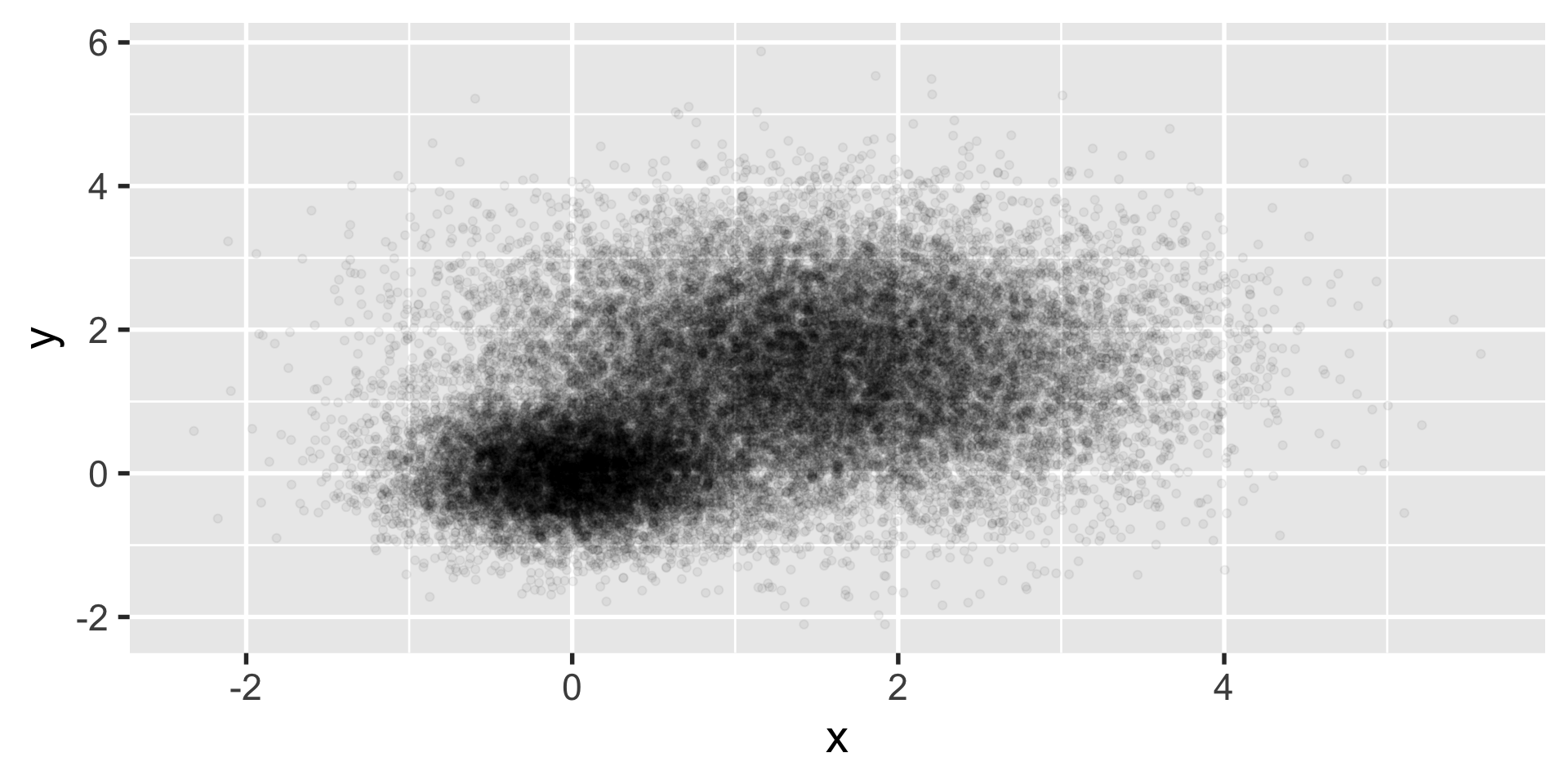
let’s say you have a ton of data such that creating a scatter plot isn’t all that useful.

we want to know if this is one cluster or two… we might look at histograms in x and y.
geom_density2d
but when that still doesn’t work, we can turn to calculating some summary statistics in 2d with geom_density2d

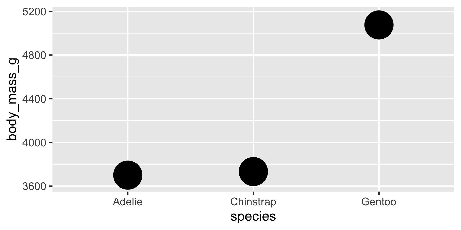
stat_summary
stat_summary is a very flexible layer that can perform computations for you and depict the results with a geom of your choice
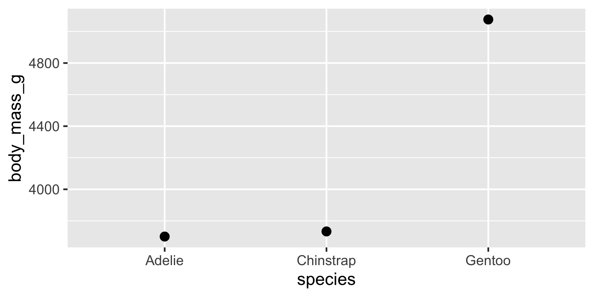
stat_summary
we can use stat_summary to show us the mean, min and max using a pointrange geom
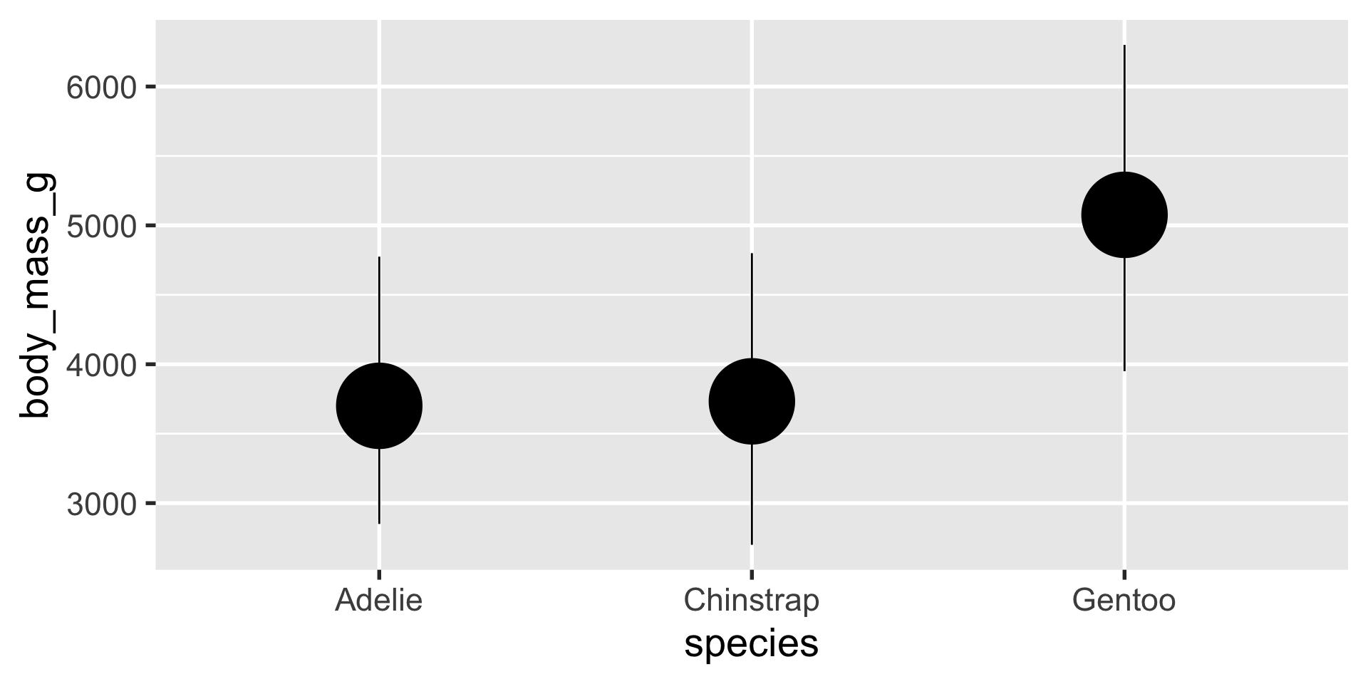
stat_summary
we can use stat_summary to show us the mean, min and max using a pointrange geom
scale_x_* and scale_y_*
occasionally we have data that is best represented on a non-linear scale, like the log-scale. ggplot makes it very easy to do this. compare:


scale_color_* and scale_fill_*


coordinate labelling
sometimes you want to format the way the axis numbers appear in a particular way, like in scientific format or in dollars.

themes
you can basically customize every aspect of the theme in ggplot.


labels
use the labs() function to set labels for any aesthetics.

legend position
the legend position can be moved using the legend.position argument to theme()

saving plots with ggsave() is one of the most important skills in using ggplot2.
it’s great if you can make your graphics in R, but you need to render your graphics to image files in order to be able to integrate them into manuscripts, websites, etc. and ggsave() gives you lots of great options for the filetype, dimensions, resolution, etc.
ggdist
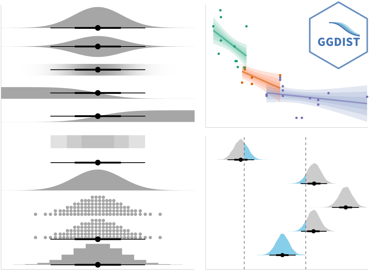
learn more: https://mjskay.github.io/ggdist/
ggrepel
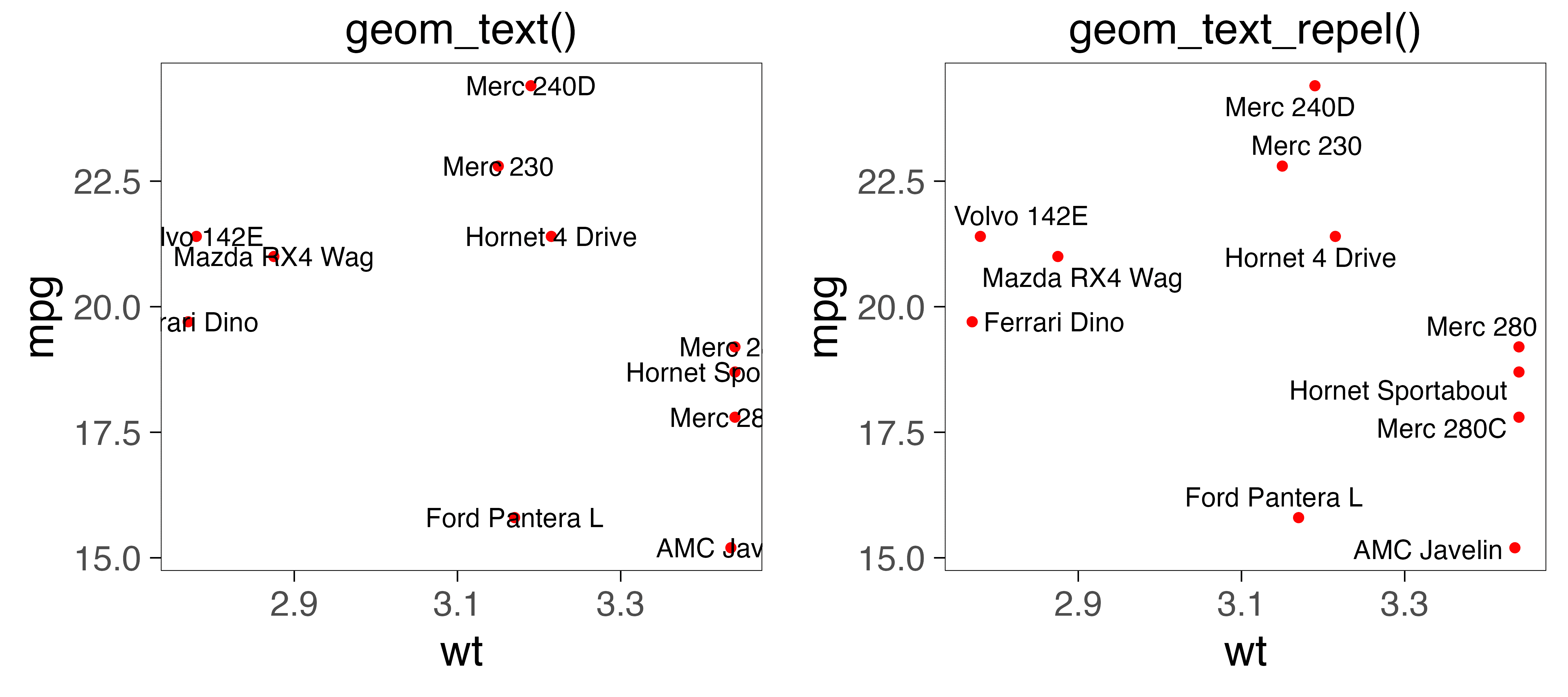
learn more: https://ggrepel.slowkow.com/
patchwork
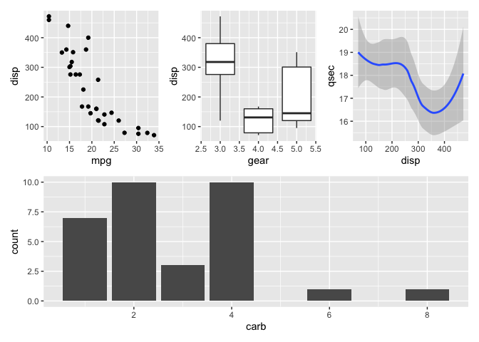
learn more: https://patchwork.data-imaginist.com/