library(datapasta)
library(tidyverse)

texas_population_over_time <- tibble::tribble(
        ~year,      ~pop,
         "1850",     212592,
         "1860",     604215,
         "1870",     818579,
         "1880",    1591749,
         "1890",    2235527,
         "1900",    3048710,
         "1910",    3896542,
         "1920",    4663228,
         "1930",    5824715,
         "1940",    6414824,
         "1950",    7711194,
         "1960",    9579677,
         "1970",   11196730,
         "1980",   14229191,
         "1990",   16986510,
         "2000",   20851820,
         "2010",   25145561,
         "2020",   29145505,
  "2024 (est.)",   31290831
  )

ggplot(texas_population_over_time, aes(x = year, y = pop / 1e6)) +
    geom_line(group = 1) +
    geom_point() +
    ggtitle("Census Population Estimate for Texas") +
    labs(
        x = "Year",
        y = "Population (in Millions)"
    ) +
    scale_y_continuous(labels = scales::comma_format()) +
    theme_bw() +
theme(axis.text.x = element_text(angle = 70, hjust = 1)) Data Visualization Activity
Outline:
- Find a Wikipedia article or other source with a table that interests you
- Copy the table to Excel to clean it up and save it as a CSV
- Load it in R
- Create a data visualization to your liking
We provide several examples to get your ideas going
Example — Start with a Place
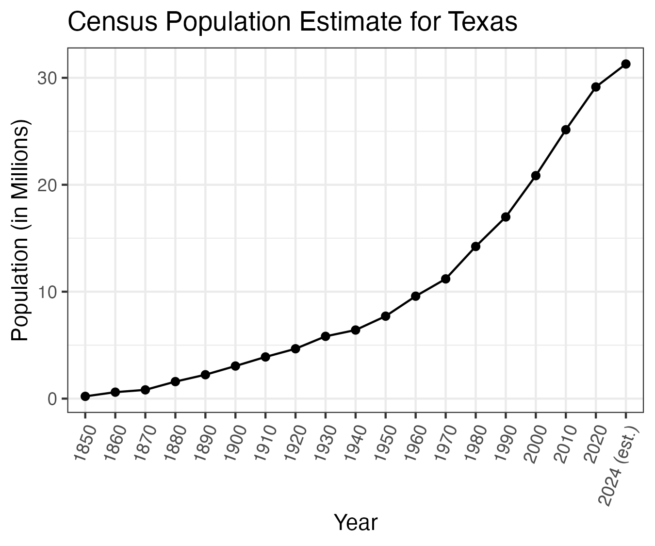
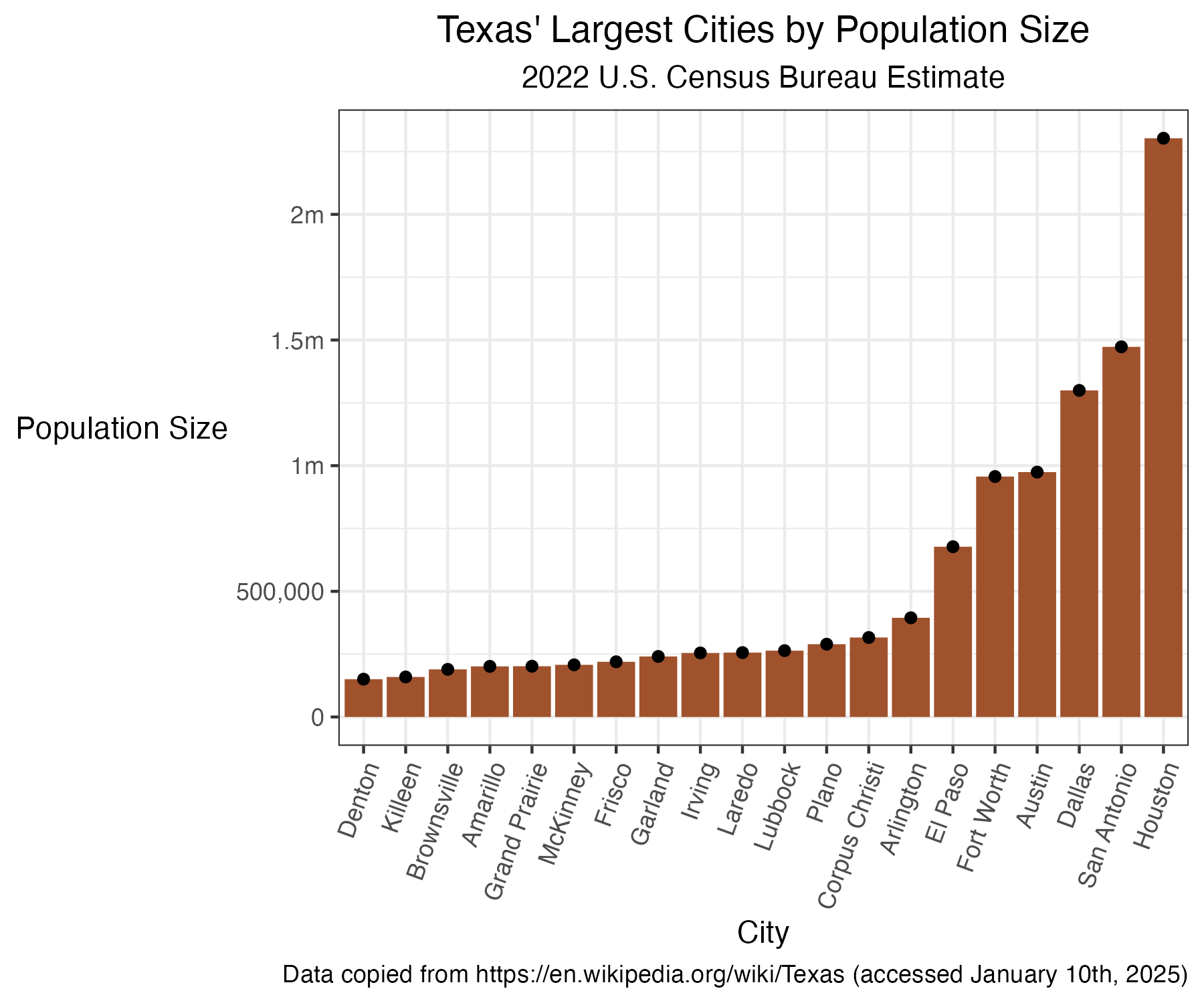
For example, I’m from Austin, Texas. I might look up https://en.wikipedia.org/wiki/Texas to see what tables the article has. I’m betting I can make a chart of population over time, or a bar chart of major city population sizes.
Example — Population Size Over Time
Example — Population Size Over Time
library(datapasta)
library(tidyverse)

texas_population_over_time <- tibble::tribble(
        ~year,      ~pop,
         "1850",     212592,
         "1860",     604215,
         "1870",     818579,
         "1880",    1591749,
         "1890",    2235527,
         "1900",    3048710,
         "1910",    3896542,
         "1920",    4663228,
         "1930",    5824715,
         "1940",    6414824,
         "1950",    7711194,
         "1960",    9579677,
         "1970",   11196730,
         "1980",   14229191,
         "1990",   16986510,
         "2000",   20851820,
         "2010",   25145561,
         "2020",   29145505,
  "2024 (est.)",   31290831
  )

ggplot(texas_population_over_time, aes(x = year, y = pop / 1e6)) +
    geom_line(group = 1) +
    geom_point() +
    ggtitle("Census Population Estimate for Texas") +
    labs(
        x = "Year",
        y = "Population (in Millions)"
    ) +
    scale_y_continuous(labels = scales::comma_format()) +
    theme_bw() +
    theme(axis.text.x = element_text(angle = 70, hjust = 1))
Example 2 - Cities by Population Size
texas_cities_by_popsize <- tibble::tribble(
        ~city_name,  ~popsize,
         "Houston",   2302878,
     "San Antonio",   1472909,
          "Dallas",   1299544,
          "Austin",    974447,
      "Fort Worth",    956709,
         "El Paso",    677456,
       "Arlington",    394602,
  "Corpus Christi",    316239,
           "Plano",    289547,
         "Lubbock",    263930,
          "Laredo",    256187,
          "Irving",    254715,
         "Garland",    240854,
          "Frisco",    219587,
        "McKinney",    207507,
   "Grand Prairie",    201843,
        "Amarillo",    201291,
     "Brownsville",    189382,
         "Killeen",    159172,
          "Denton",    150353
  )

ggplot(texas_cities_by_popsize,
  aes(x = forcats::fct_reorder(city_name, popsize),
      y = popsize)) +
    geom_col(
        fill = 'sienna'
    ) +
    geom_point() +
    theme_bw() +
    theme(
        axis.text.x = element_text(angle = 70, hjust = 1),
        plot.title = element_text(hjust = 0.5),
        plot.subtitle = element_text(hjust = 0.5),
        axis.title.y = element_text(angle = 0, vjust = 0.5)
        ) +
    scale_y_continuous(
        breaks = c(0, 5e5, 1e6, 1.5e6, 2e6),
        labels = c('0', '500,000', '1m', '1.5m', '2m')
    ) +
    labs(
        y = "Population Size",
        x = "City",
        title = "Texas' Largest Cities by Population Size",
        subtitle = "2022 U.S. Census Bureau Estimate"
    )
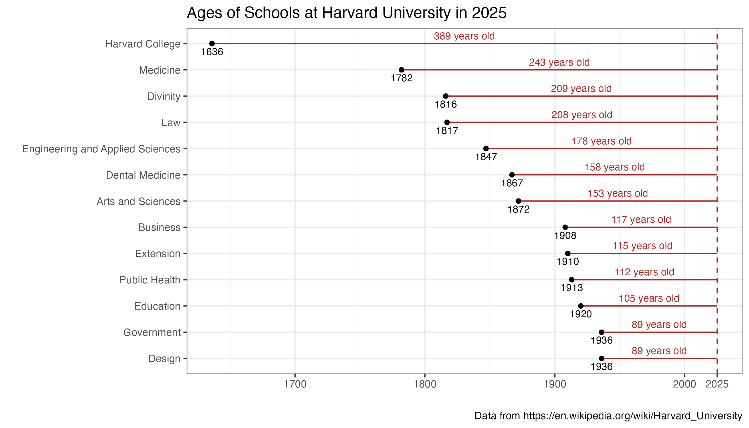
Example 3 - Age of different schools at Harvard
harvard_school_ages <- tibble::tribble(
                             ~school, ~founding_year,
                   "Harvard College",     1636,
                          "Medicine",     1782,
                          "Divinity",     1816,
                               "Law",     1817,
  "Engineering and Applied Sciences",     1847,
                   "Dental Medicine",     1867,
                 "Arts and Sciences",     1872,
                          "Business",     1908,
                         "Extension",     1910,
                            "Design",     1936,
                         "Education",     1920,
                     "Public Health",     1913,
                        "Government",     1936
  )

harvard_school_ages$age <- 2025 - harvard_school_ages$founding_year

ggplot(harvard_school_ages,
    aes(y = forcats::fct_reorder(school, age), x = age)) +
    geom_col(fill = 'firebrick')

ggplot(harvard_school_ages,
    aes(y = forcats::fct_reorder(school, age), x = founding_year, xend = 2025)) +
    geom_segment(color = 'firebrick') +
    geom_point() +
    geom_vline(xintercept = 2025, linetype = 'dashed', color = 'firebrick') +
    geom_text(aes(x = (2025 + founding_year)/2, label = paste0(age, ' years old')), nudge_y = .3, size = 3, color = 'firebrick') +
    geom_text(aes(x = founding_year, label = founding_year), nudge_y = -.3, size = 3) +
    theme_bw() +
    scale_x_continuous(breaks = c(1700, 1800, 1900, 2000, 2025)) +
    ggtitle("Ages of Schools at Harvard University in 2025") +
    labs(y = "", x = "", caption = "Data from https://en.wikipedia.org/wiki/Harvard_University")

